matplotlib 설치
C:/Users/Admin/AppData/Local/Python/pythoncore-3.14-64/python.exe -m pip install matplotlib지금 쓰는 파이썬에 정확히 설치
설치 확인
python -m pip listmatplotlib 보이면 성공 👍
선 그래프로 시각화하는 프로그램
import csv
import matplotlib.pyplot as plt

sample = []
avg_temp = []
min_temp = []
max_temp = []

##### 파일 불러오기 #####

with open("test.csv", "r", encoding="utf-8", errors="ignore") as file:
    reader = csv.reader(file)

    header = next(reader) # 맨 첫줄을 읽어드리기

    for row in reader :
        print(row) # row의 타입(자료형) == list
        sample.append(row[0])
        avg_temp.append(float(row[2]))
        min_temp.append(float(row[3]))
        max_temp.append(float(row[4]))

##### 시각화 #####

plt.plot(sample, avg_temp, color="green", label="avg")
plt.plot(sample, min_temp, color="blue", label="min")
plt.plot(sample, max_temp, color="red", label="max")
plt.legend()
plt.xticks([]) # x출 글자 제거
plt.show()
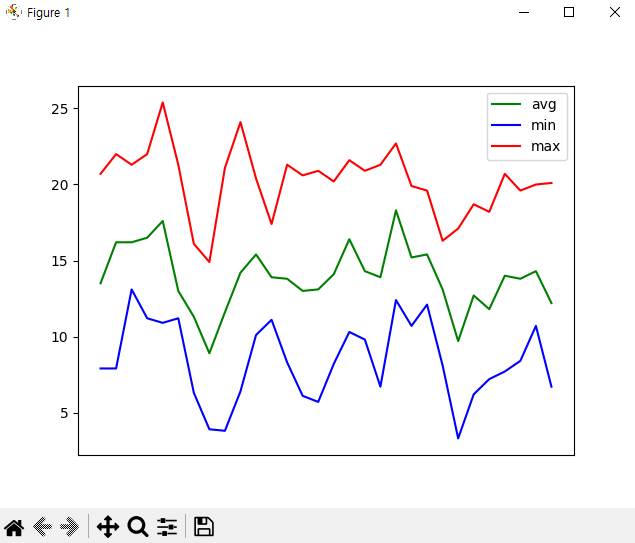
이 코드는 CSV 파일에 저장된 평균기온, 최저기온, 최고기온 데이터를 읽어서
선 그래프로 시각화하는 프로그램이다
import csv
import matplotlib.pyplot as plt
🔼 사용한 라이브러리
csv : CSV 파일을 읽기 위한 파이썬 기본 라이브러리
matplotlib : 데이터를 그래프로 시각화할 때 사용하는 라이브러리
sample = []
avg_temp = []
min_temp = []
max_temp = []
🔼 데이터 저장용 리스트 생성
sample : x축 데이터 (날씨 등)
avg_temp : 평균 기온
min_temp : 최저 기온
max_temp : 최고 기온
데이터를 나눠서 저장해야 그래프를 그릴 수 있음
with open("test.csv", "r", encoding="utf-8", errors="ignore") as file:
    reader = csv.reader(file)
    header = next(reader)
🔼 CSV 파일 읽기
open() : 파일 열기
encoding="utf-8" : 한글 깨짐 방지
next(reader) : 첫 줄(컬럼명) 건너뛰기
for row in reader:
    print(row)
    sample.append(row[0])
    avg_temp.append(float(row[2]))
    min_temp.append(float(row[3]))
    max_temp.append(float(row[4]))
🔼 데이터 가공
한 줄씩 읽으면서 리스트에 저장
문자열이라서 float()로 숫자 변환 필수!
plt.plot(sample, avg_temp, color="green", label="avg")
plt.plot(sample, min_temp, color="blue", label="min")
plt.plot(sample, max_temp, color="red", label="max")
🔼 그래프 그리기
평균기온 ➡ 초록색
최저기온 ➡ 파란색
최고기온 ➡ 빨간색
한 그래프에 3개 선을 동시에 그림
plt.legend()
plt.xticks([])
plt.show()
🔼 그래프 꾸미기
legend() : 범례 표시(avg, min, max)
xticks([]) : x축 글자 제거 (너무 많아서 보기 힘들 때)
show() : 그래프 출력
'🍏 개발일기' 카테고리의 다른 글
| 미세먼지 수준에 따라 강남역 2호선 이용객 수 평균이 어떻게 달라지는지 (0) | 2026.03.20 |
|---|---|
| OAuth (0) | 2026.03.19 |
| CSV 파일을 활용한 온도 데이터 시각화 (0) | 2026.03.17 |
| “이 장애, 얼마나 심각한가요?” 사용자 경험을 기준으로 비즈니스 심각도를 정의하다를 읽으며.. (0) | 2026.03.15 |
| 코드 없이 이해하는 '단일책임원칙(SRP)' 이야기를 읽으며.. (0) | 2026.03.14 |